Polycam's Vision 25 Brand Identity System
Disciplines
Brand
Art Direction
Design Systems
Identity
Company
Polycam
Role
Freelance Brand Designer
Outcome
Starting from a loose brand system
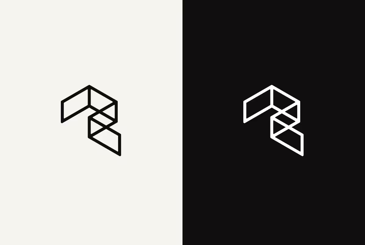
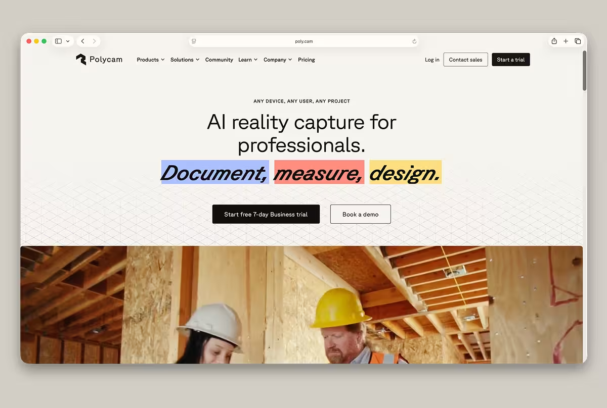
Polycam had worked with an external agency for months before bringing me in to take over. With a multi-product launch approaching, I inherited a logo, a typeface, and a loose color concept and turned them into a solid brand system ready to ship with a full Webflow site launch.
The new brand, the new site, and an in-house brand video for the company's Vision 25 launch all had to go live on the same day. The team was busy and needed direction fast.
Finding a shared visual language
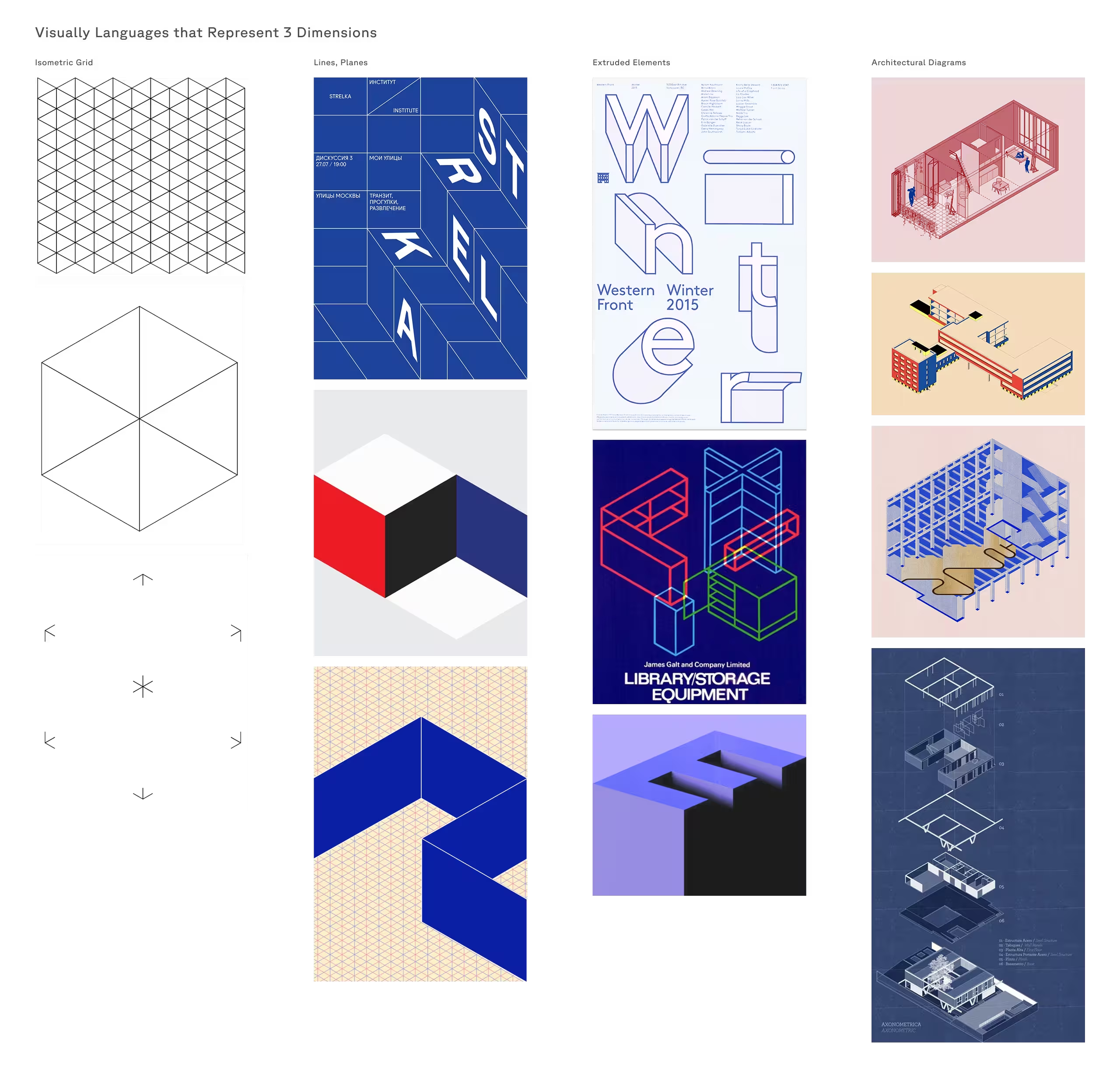
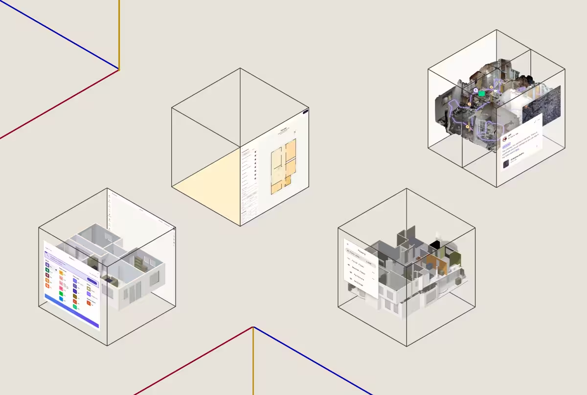
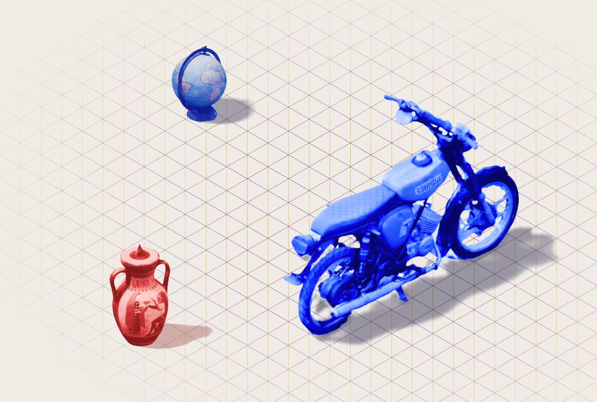
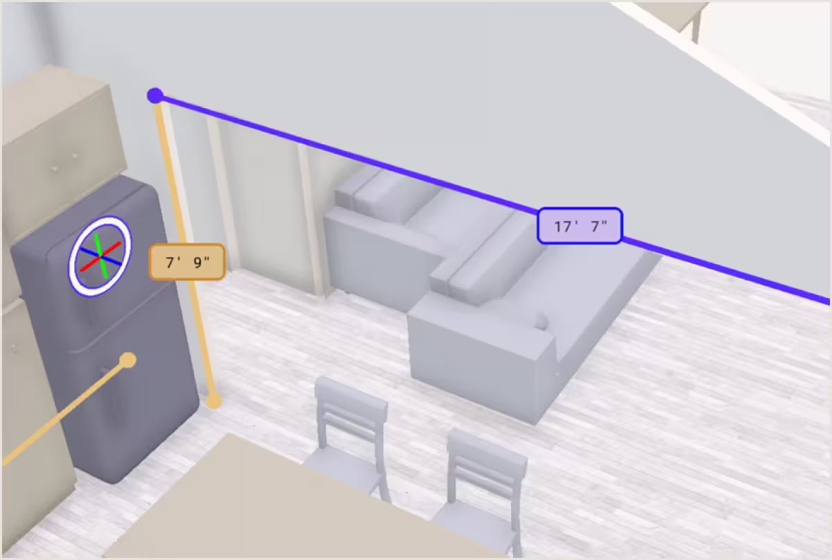
While the CEO had a strong creative vision, other stakeholders weren't fully aligned on the underlying brand strategy. However, I had some solid ideas to build on from the previous agency and in-house creatives — a simplification of the 3D world represented in a 2D space. This idea encapsulates how simple Polycam makes 3D scanning — something anyone with an iPhone can do.
We explored a few visual languages on this theme: isometric grids and shapes; layered, tonal architectural blueprints; lines, planes, and extruded elements; 3D Cartesian plots. Anaglyphs and chromatic aberration looked cool, but read more like "media" than a "precision tool," so we cut it.
Keeping the brand's existing equity
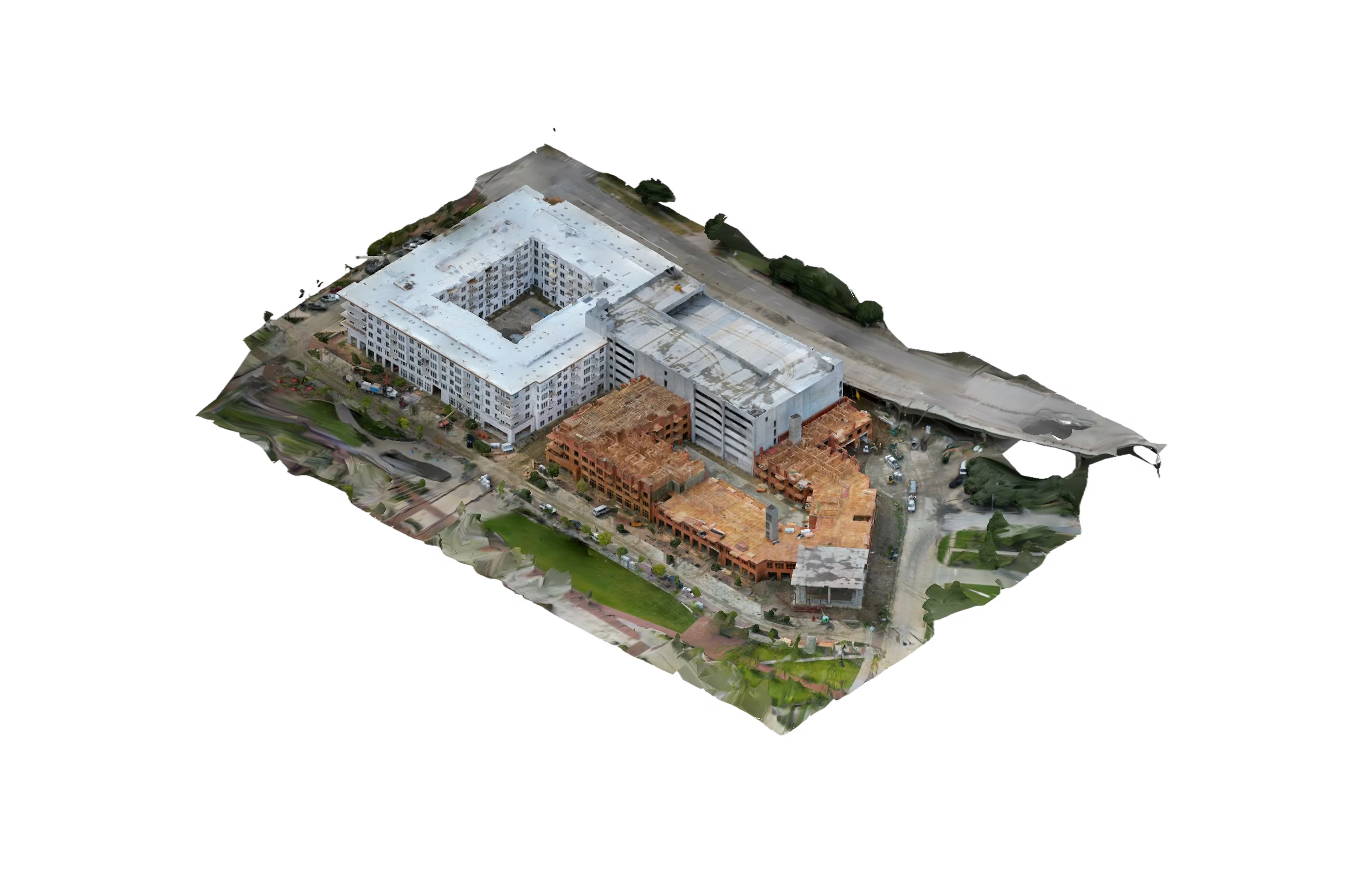
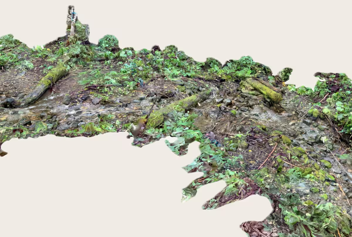
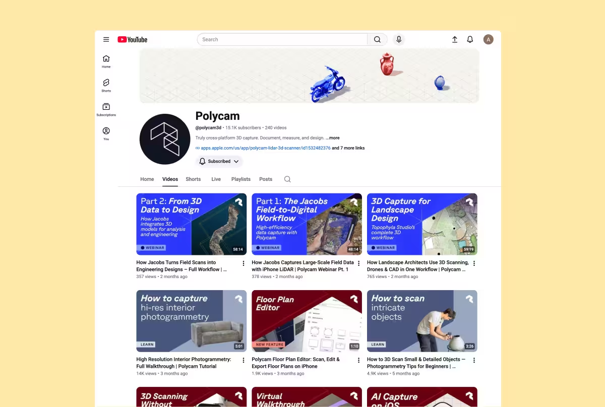
Up until this point, the brand was represented through the product experience, so it was important to leverage that visual equity, especially the global library of 3D captures (the largest in the world!) that made the brand feel alive and tactile. The goal was to move toward the AEC B2B sector while keeping the artist and creator audience that helped build the company.
Translating dimensional complexity into clarity
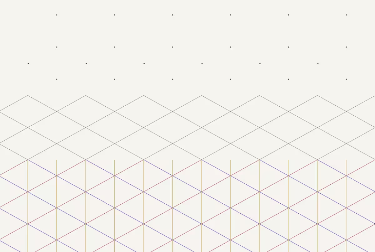
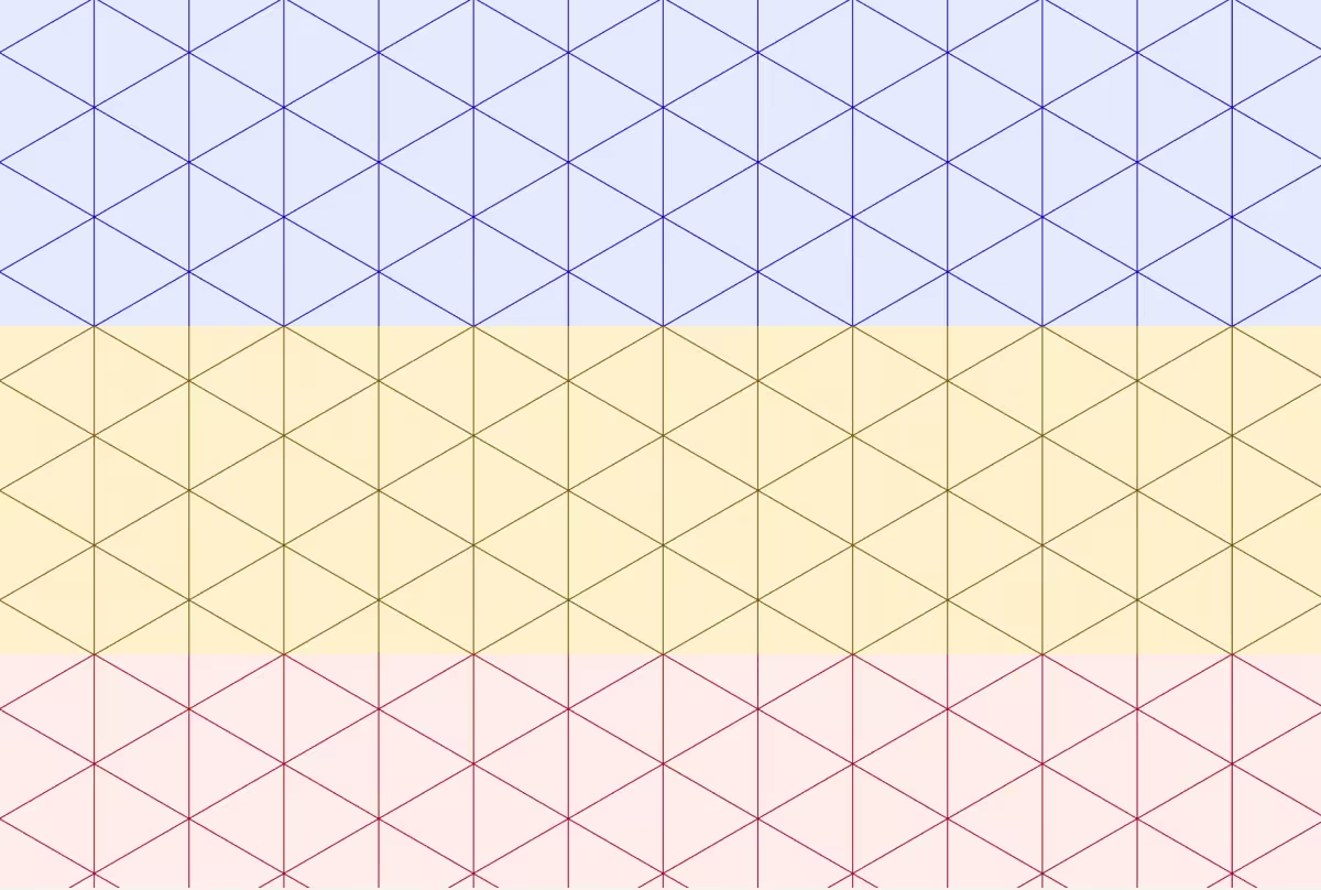
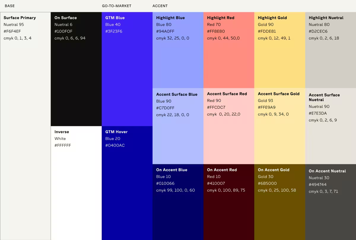
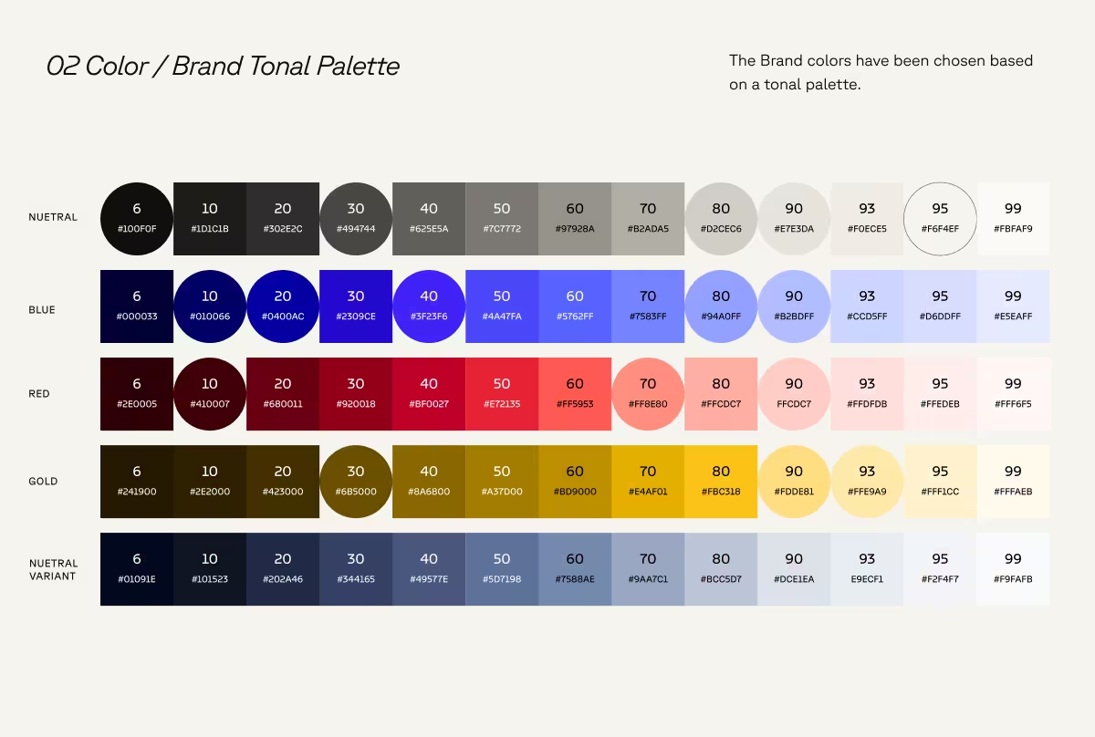
The CEO became my de facto executive creative director, which accelerated the process. A few things were non-negotiable: a red, blue, and gold palette, "living isometric grid." Those guardrails fit the brand's new guiding philosophy: translate dimensional complexity into clarity. 2D Isometric grids simplify spatial relationships. The tonal palette nods to information-dense blueprints.

When the visual direction was questioned
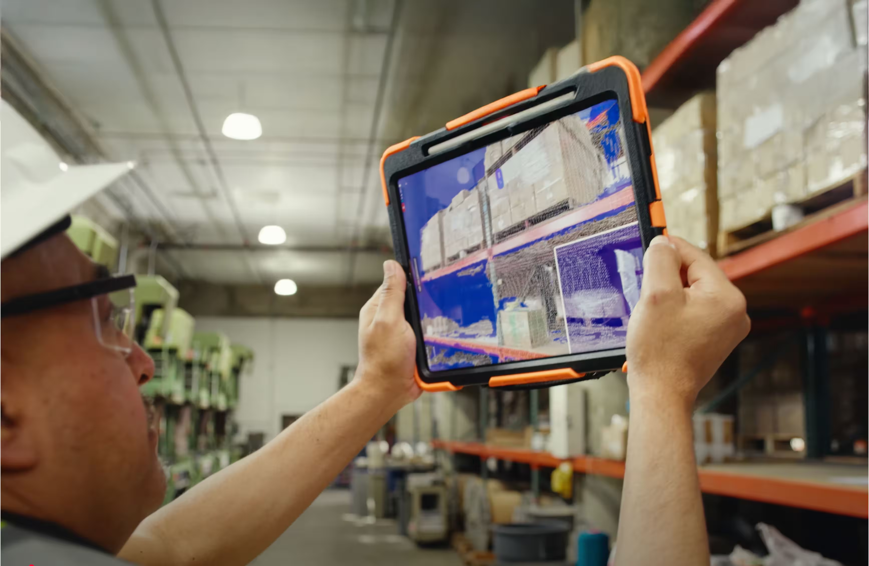
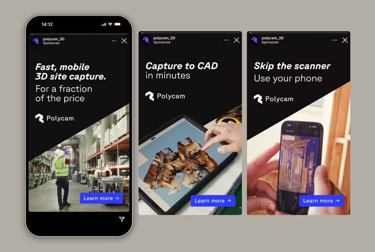
One challenge: some stakeholders felt the visual direction wasn't mature enough for the professional AEC audience. An early landing page draft leaned on an isometric cube illustration. We swapped it for a cut of the Vision 25 brand video showing professionals actually using the tool — and months later, customer interviews confirmed it was the right call. People responded to seeing the product in someone's hands. We leaned into "in-hand" imagery across brand and advertising from there.
What the new system made possible
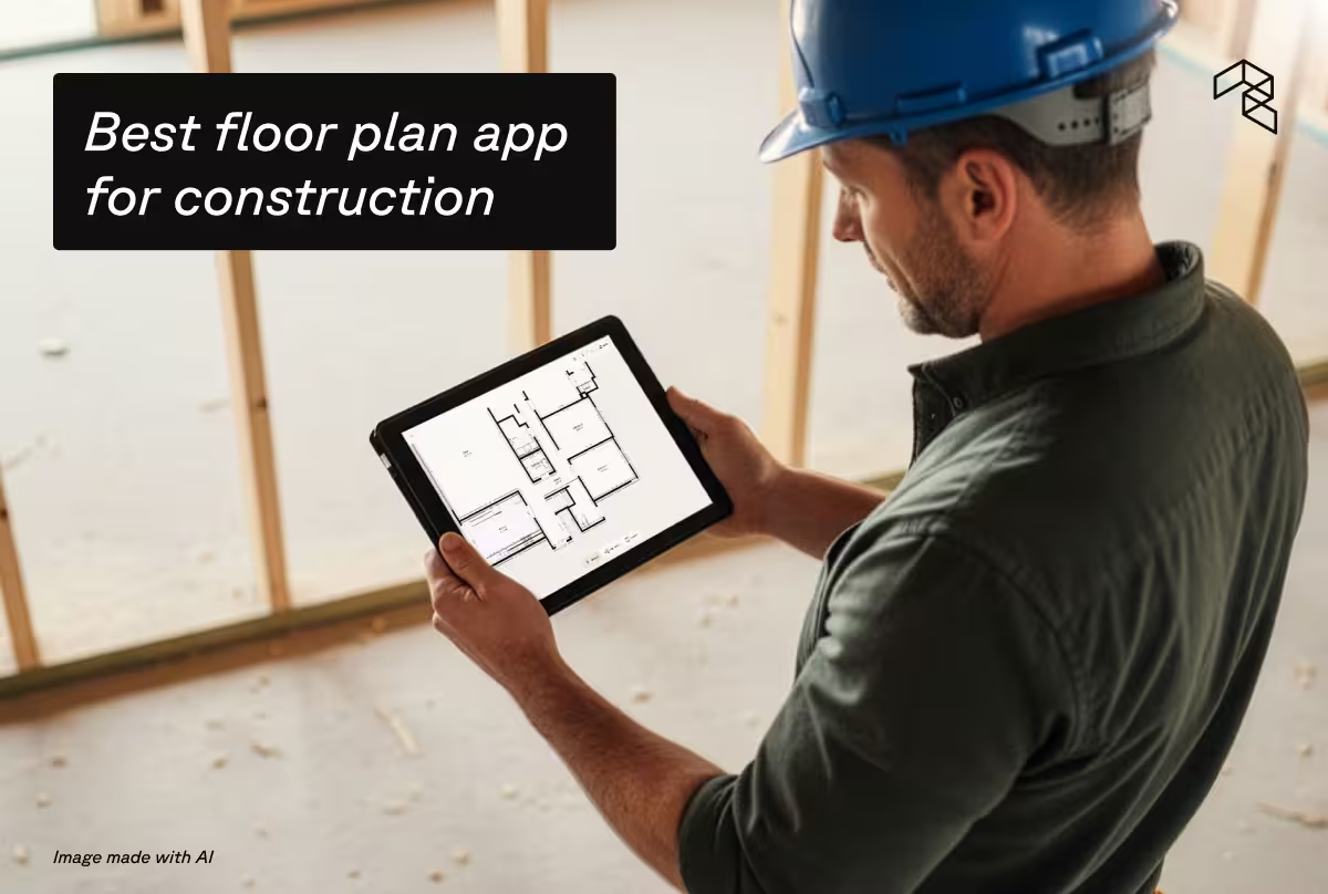
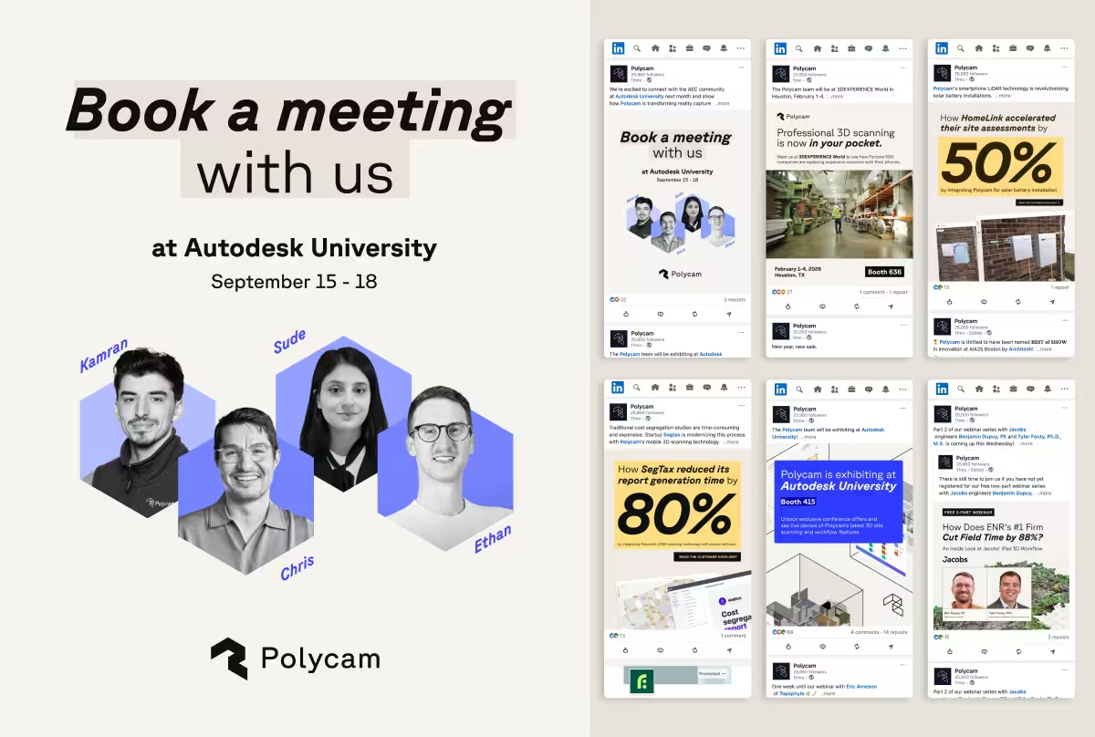
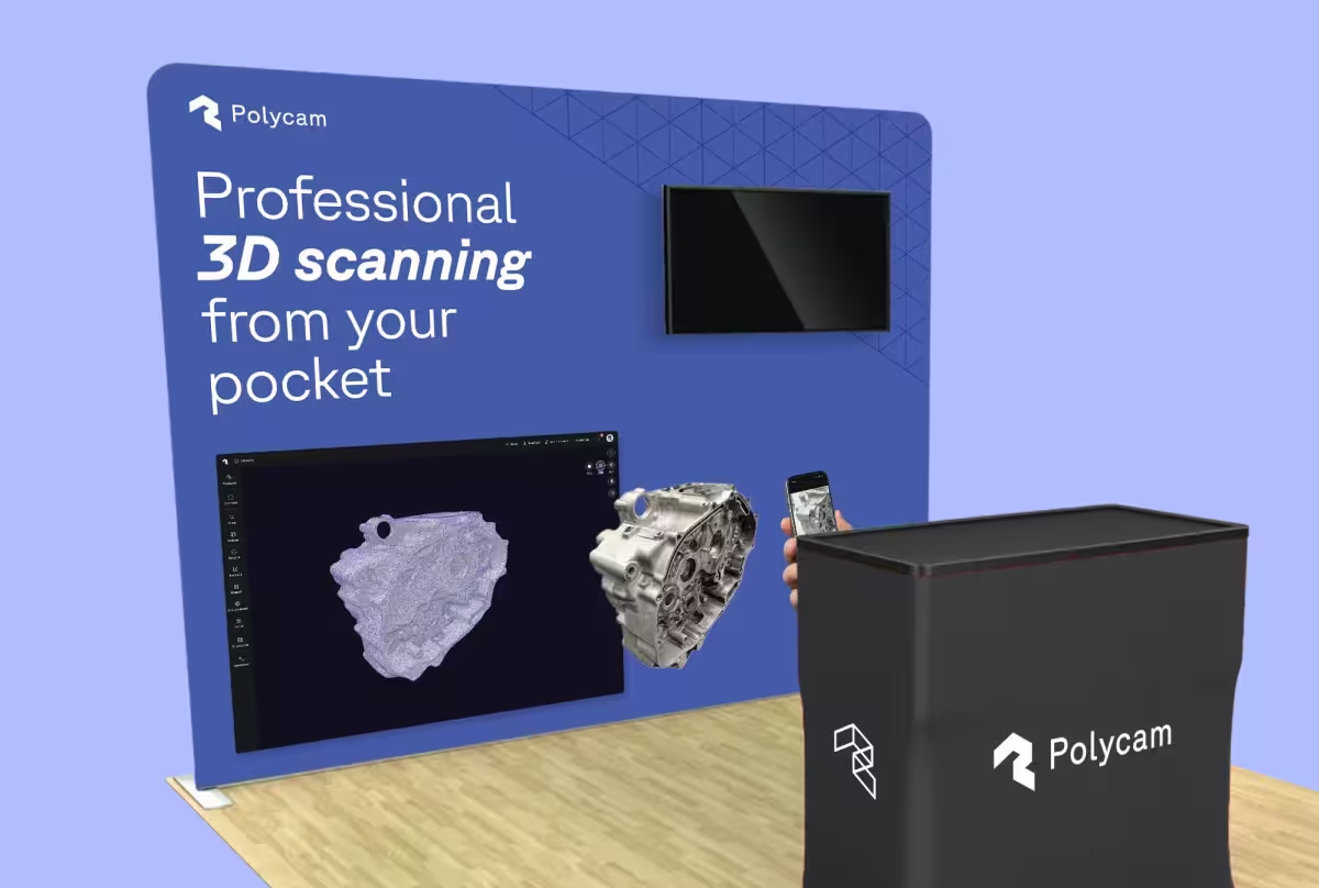
After Vision 25 launched, I joined full-time and continued building, implementing dark mode within the product, developing contextual assets for SMB audiences, and expanding the asset and template library.
What I'd do differently
"Phase 2" of the project — implementing the brand into the UI of the product — was a bit of a challenge. The design system proved quite a beast to update, but it was also working pretty well as-is, so there was little motivation to add it to the roadmap. This created a visual mismatch between the brand and the product.
Meanwhile, the marketing team was working in a highly reactive state, and we had an ongoing bottleneck in creative production.
If I could go back in time knowing all of this, I'd root the brand system in the product's existing visual language rather than start over. This would have freed up capacity to do more impactful work at scale. The product design system could have been updated deliberately and systematically, and the brand could have followed. I'd also push to invest more in brand strategy and positioning and open up resources to build a more robust library for the marketing team.
Creative vision: Elliot Spellman
Product lead: Nick Woods
Brand partner: Margaret Lindon
3D visuals, ideation and motion: Craig Stucky
Digital design, engineering and Product: Lai Jing Chu