Polycam's Vision 25 Brand Identity System
Disciplines
Brand
Art Direction
Design Systems
Identity


The Brand Mission evolved over time. Many months after the Vision 25 launch it was reworded from a more generic statement about democratizing 3D scanning: To make professional 3D capture effortless and accessible, empowering anyone to transform the physical world into digital workflows.
Starting from loose positioning and visual direction
At the end of 2024, Polycam asked me to bring their new brand identity across the finish line and apply it to a new marketing website aimed beyond hobbyists and toward a B2B market.
Polycam is a 3D scanning platform for capturing real-world objects, structures, and spaces. The company started in 2020, gained popularity with hobbyists, and has proven it can democratize 3D scanning using iPhone, tablet, and drone footage instead of expensive 3D cameras.
I inherited a logo, a typeface, and a loose color concept from an outside agency, some in-house exploration, and creative direction from a co-founder. The new brand, the new site, and an in-house brand video for the company's Vision 25 launch all had to go live on the same day. The team was busy and needed direction fast.
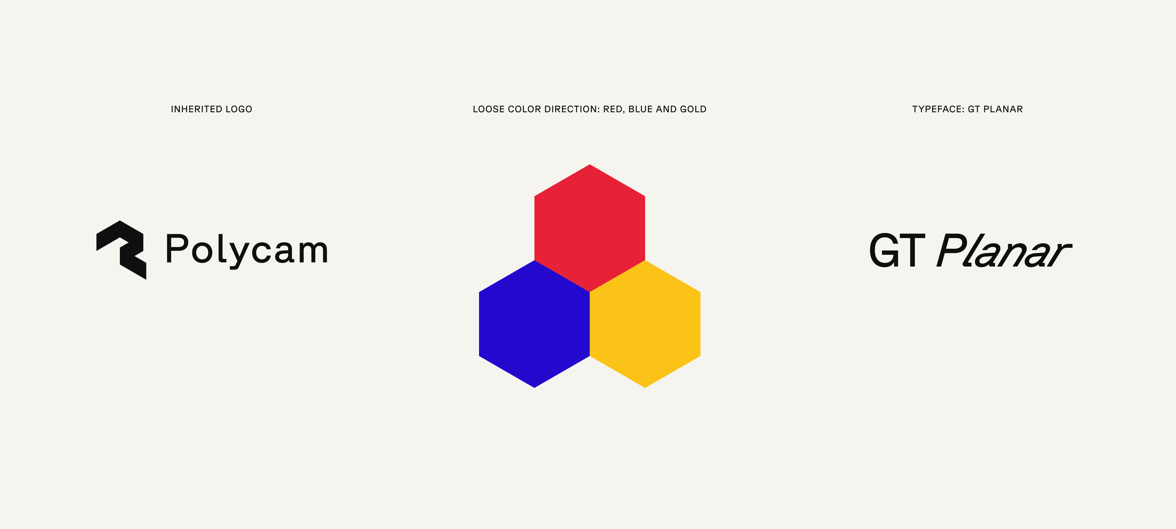
The logo, color direction and the the main typeface were rigid constraints I had to work within.
How can we show how easy it is to get quality scans using Polycam?
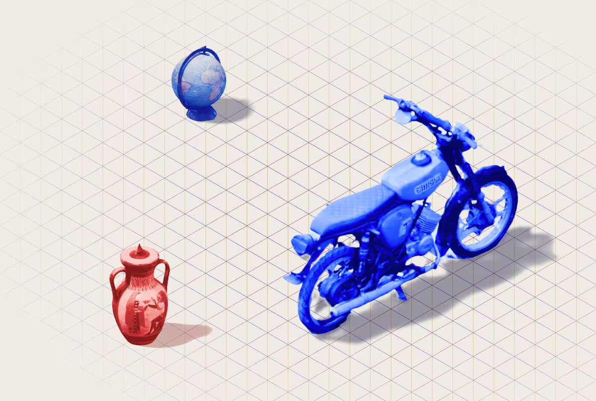
One goal I used as my north star, aligned with the agency-led direction, was simplifying 3D into an isometric grid to make it feel more accessible. This idea connects with how simple Polycam makes 3D scanning — something anyone with an iPhone can do.
The isometric grid was a key boundary for every other decision to push up against. With the grid as a base element, I explored a few additional dimensional visual languages that we could layer on top of the isometric theme: isometric grid variations and shapes; layered, tonal architectural blueprints; lines, planes, and extruded elements; 3D Cartesian plots.





Keeping the brand's existing equity
Up until this point, the product experience WAS the brand, so it was important to leverage that visual equity, especially the global library of community captures (the largest in the world!) that made the brand feel alive and tactile. We needed to move the brand toward the AEC B2B sector without abandoning the artist and creator audience that helped build the company, which meant carefully curating visuals within that tension.

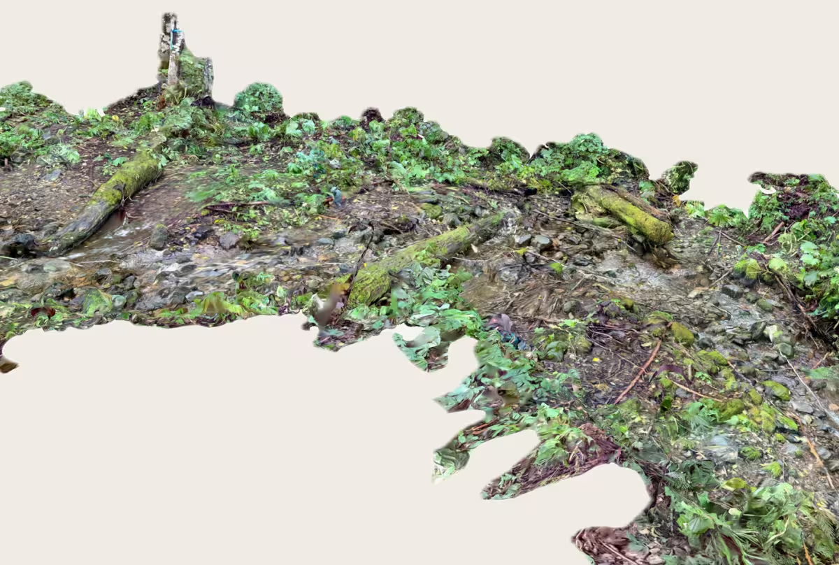

Balancing simplicity and playfulness with a product that delivers serious results for business professionals
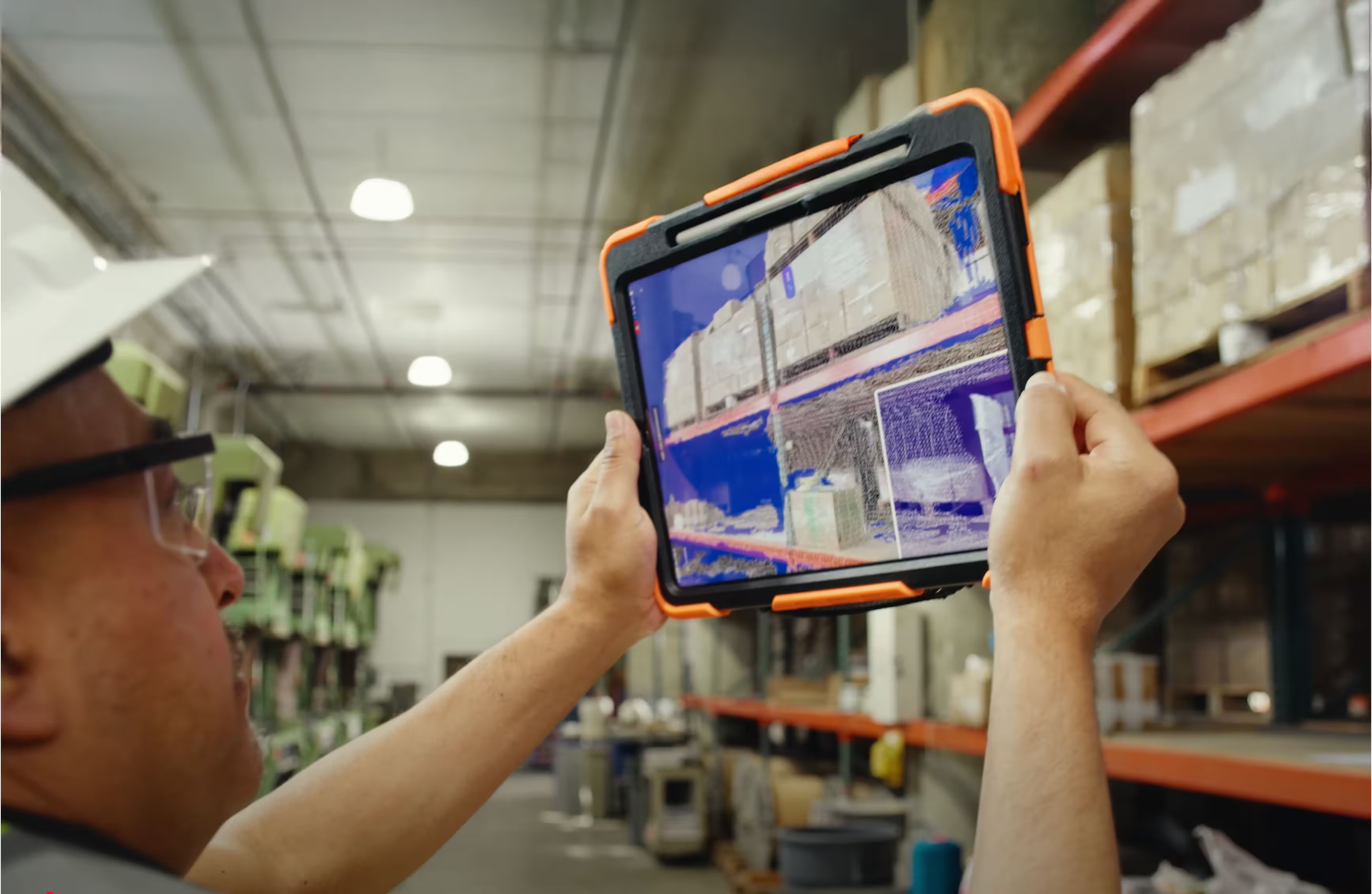
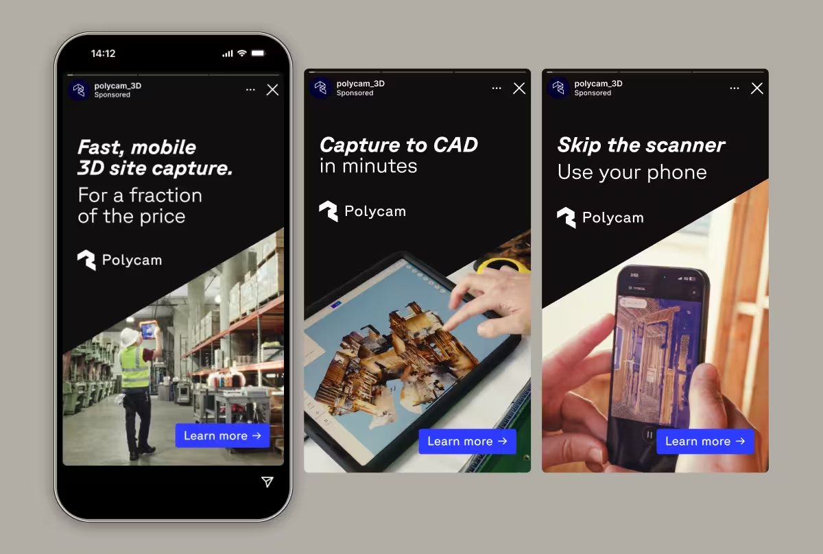
An early landing page draft leaned on a colorful isometric cube illustration, and some stakeholders felt that it wasn’t mature enough for a professional audience. We swapped it for a cut of the Vision 25 brand video showing professionals using the tool — and months later, customer interviews confirmed it was the right call. People responded to seeing the product in action and in-hand, especially professionals in construction, industrial design, insurance, and inventory/logistics. We leaned into this in-hand imagery across brand and advertising.

What the new system made possible
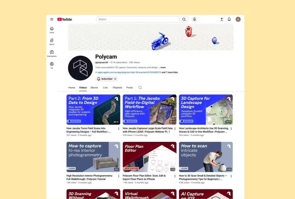
At launch, the team had a brand new B2B-focused website, fresh visuals for LinkedIn and YouTube, and a visual system to lean on.
The team brought me on full-time after Vision 25 launched, and I kept building: implementing dark mode in the product, developing contextual assets for SMB audiences, consulting on image art direction, expanding the asset and template library, and building additional marketing initiatives, including customer stories and a blog.
Over the next year, the team clarified the brand strategy, including honing in on the ICP and Polycam’s unique positioning based on customer research. Polycam continues to lead in mobile-device reality capture and sits at a unique intersection of approachable/accessible and professional-grade data capture.




Team credits:
Creative vision: Elliot Spellman
Head of Product: Nick Woods
Brand Partner: Margaret Lindon
3D visuals, motion and ideation: Craig Stucky
Digital Design & Engineering, Product Management: Lai Jing Chu